Html-CSS
 )
)
overview
static websites have their files stored on the server waiting to be displayed as they are.
dynamic website is an application that is executed at the server, they take data from DB and assemble it into a website.
html
it is a markup language used to describe the content.
html structure
<!DOCTYPE html>
<!-- tells browser that this document uses html-->
other standard elements:
<html lang="en">
    <head></head>

    <body></body>
</html>
it is best practice that each page has only one <h1> tag.
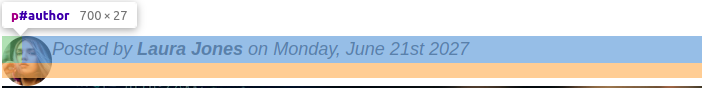
<!-- strong makes text bold, em is italic or emphasize -->
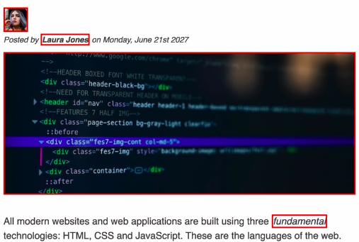
<p>Posted by <strong>Laura Jones</strong> on <em>Monday, June 21st 2027</em></p>
lists
ordered lists are made like this:
		<ol>
      <li>The opening tag</li>
      <li>The closing tag</li>
      <li>The actual element</li>
    </ol>
unordered list uses same structure but instead of <ol> use <ul>
images
the has no closing tag
<img src="laura-jones.jpg" alt="image of writer" />
the options inside the tag are called attributes
links
a link is made by placing a url inside the href attribute of an anchor element:
<!-- this link will open on new tab-->
<a href="https://developer.mozilla.org/en-US/" target="_blank"
        >MDN web docs</a>
other structuring elemnts
elements such as nav, header and article will help further group the page.
nav is for navigation bar.
header element represents introductory content (multiple headers can exists in one page).
article is like the opposite of header, it is the bottom of page, or contents.
aside is for secondary info that complements the contents of the page, such as the “related links” section after an article or the side-bar.
semantic html
what the element means or what it stands for. nav, header and footer are examples of elements that have semantic meaning.
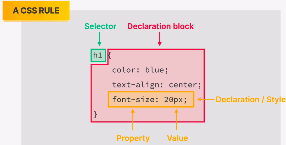
CSS
css describes the style of the html content.
css has properties (similar to html attributes).
 )
)
where we write css
- inline css: not preferred
<h1 style="color: blue;">📘 The Code Magazine</h1>
- internal css: we declare style element in the head of html:
<head>
  <meta charset="UTF-8" />
  <title>The Basic Lang of The Web: HTML</title>
  <style>
    h1 {
      color: blue;
    }
  </style>
</head>
this is better because we group all the style in one place.
- external css: we put css into a separate file. we then link html to the style file.
<head>
  <meta charset="UTF-8" />
  <title>The Basic Lang of The Web: HTML</title>
  <link href="style.css"
        rel="stylesheet">
</head>
styling text
we can make h2 bigger than h1 and that wont change the fact that h1 is semantically bigger than h2.
p {
  font-family: sans-serif;
  font-size: 22px;
  line-height: 1.5;
}
the above line-height property means that the line height is 1.5 x font-size.
inheritance exists in css.
we can also combine selectors in two ways:
first, the list selector:
h1,
h2,
h3,
h4,
p,
li {
  font-family: sans-serif;
}
second, the descendant selector:
/* select all p that are inside a footer element */
footer p {
  font-size: 12px;
}
the above css will select this html:
<footer>
<p> Copyright © 2022.</p>
</footer>
element class and ID selectors
id selector
we can tag an element with an id:
<p id="author">Posted by <strong>Laura Jones</strong> on Monday, June 21st 2027</p>
then we can select it and style it:
#author {
  font-style: italic;
}
class selector
class selectors can be reused. we declare them as follows:
<p class="related-author">By Jim</p>
you can add multiple classes to an element by separating class names using a space.
<p class="related-author second-class">By Jim</p>
then we select them:
.related-author {
  font-size: 18px;
  font-weight: bold;
}
working with colors
the instructor prefers a grey shade for text: color: #444;
pseudo classes
A CSS pseudo-class is a keyword added to a selector that specifies a special state of the selected element(s).
li:first-child {
  font-weight: bold;
}

li:nth-child(odd) {
  color: red;
}

/* select the first paragraph inside article's header even if there are other elements before p */
article header p:first-of-type {
  background-color: rgb(197, 197, 197);
}
we can also chain pseudo classes:
nav a:link:last-child {
  margin-right: 0;
}
styling links
/* styling links */
a:link,
a:visited {
  color: #1a8991;
  text-decoration: none;
}
a:link selects all links that have href attributes.
a:hover {
  font-weight: bold;
  text-decoration: underline wavy orangered;
}
css theory #1: conflicts between selectors
 )
)
 )
so in the above case, the id selector will apply its font-size.
)
so in the above case, the id selector will apply its font-size.
vscode hints at the priority of a selector when hovering over it (Selector Specificity 1.0.0).
css theory #2: inheritance and the universal selector
not all props get inherited, mostly text related props are inherited.
an inherited prop is always overwritten by any selector that changes the same prop.
the universal selector (*) selects every element on the page:
* {
  line-height: 1.5;
}
the universal selector has the lowest priority.
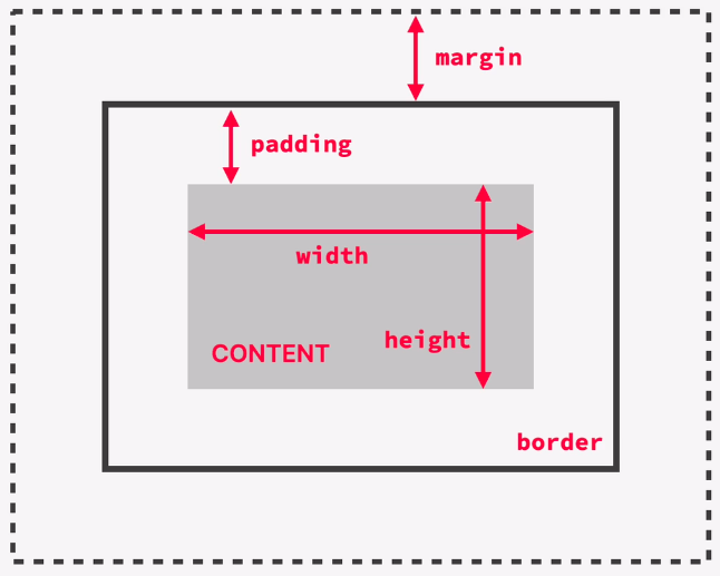
css theory #3: box model
defines how each element is displayed on the page and calculates sizes. each element is considered to be a box.
the parts of an element from the box model perspective are:
- content: text, image, table ..etc.
- border: goes around the element, it is inside the element.
- padding: space bw content and border, also inside the element.
- margin: space outside element.
 )
)
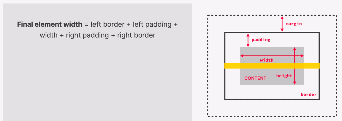
calculating element size
you can either specify content width and height or not, if you the size is implied from the content itself.
the final size of an element includes the border and the padding on both sides:
 )
)
sometimes it is useful to reset all the default margins and padding, we can do that using the global selector (*). we do this at the beginning of every project.
* {
  margin: 0;
  padding: 0;
}
when creating space between elements it is better to stick to one side (ex: margin-bottom).
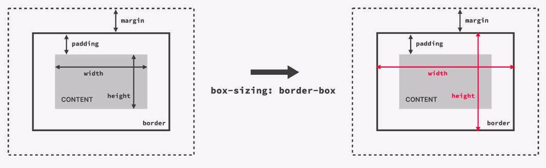
changing the box model: border box
we can change the way an element’s size is calculated by:
box-sizing: border-box
with this, we set the element’s size and it sticks to that size regardless of padding and border size.
 )
)
adding dimensions
we can specify size in pixels.
we can specify width in percent of parent size.
centering elements
- we first put all of our page in a container
- give the container a selector (like a class)
- give the container a width (otherwise there is nothing to center)
- add left and right margins, both margins should be equal and this creates the centering effect. using auto on both margins means they are both the same as calculated by the browser.
.container {
  width: 700px;
  margin-left: auto;
  margin-right: auto;
}
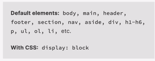
css theory #4: different types of boxes
block-box
some elements occupy the entire space they can take
most of the elements are block level.
 )
)
 )
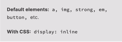
Inline-box only occupy the size of their content
)
Inline-box only occupy the size of their content
with inline elements, padding and margins only work horizontally and width and hight wont work.
 )
)
 )
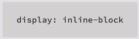
inline-block box
)
inline-block box
behaves like an inline box since it only occupies content size. but also behaves like block box since we can apply margins and paddings as block boxes.
 )
images are inline-block by default.
)
images are inline-block by default.
css theory #5: absolute positioning
there are many positioning modes in css but the most important are:
- normal flow: it is the default positioning. it can also be specified in css: (position: relative) elements are laid out according to their order in the html code
- absolute positioning:
position: aboslute
element will lose impact on surroundings and might even overlap with them!
to position the element; we use top, bottom ..etc in relation to a relative positioned container (by default: in relation to the viewport).
to position element with respect to other element:
- first set the other element position to “relative”
- make sure that the first element is child or sub-child to the relative position element.
<aside>
<button>💗Like</button>
</aside>
aside {
  position: relative;
}

button {
  position: absolute;
  bottom: 20px;
  right: 5px;
}
fixed position
position: fixed. will fix the element on the viewport and it wont move as we scroll. just like absolute position, this too will take the element out of the flow of the page.
pseudo elements
these elements are inline elements.
elements that do not exists in html but we can still style them in css, such as the first letter of paragraph.
h1::first-letter {
  font-style: normal;
}
adjacent sibling selector
siblings are element that has the same parent. adjacent sibling is the one immediately after the target element.
h3 + p {
  background-color: aliceblue;
}
<article>
	<h3>What is HTML?</h3>
      <p>
        HTML stands for <strong>H</strong>yper<strong>T</strong>ext
        <strong>M</strong>arkup <strong>L</strong>anguage. It's a markup
        language that web developers use to structure and describe the content
        of a webpage (not a programming language).
      </p>
      <p>
        HTML consists of elements that describe different types of content:
        paragraphs, links, headings, images, video, etc. Web browsers understand
        HTML and render HTML code as websites.
      </p>
      <p>In HTML, each element is made up of 3 parts:</p>
</article>
the above css would select every first paragraph that comes after h3.
after and before
we can create and style pseudo elements from the css. this is useful for small elements that we dont want to add to html.
.post-header::after {
  content: "ONLINE";
}
section 4: layouts
layout is the way text, images and other content is placed on a page.
page layout vs component layout
 )
)
the 3 ways of building layouts
float layouts
old way, do not use.
a float element is completely out of the flow, as if it is not on the page.
.author-image {
  border-radius: 50%;
  float: left;
}
 )
as you can see, the paragraph element (blue) starts behind the image (float). to fix this we make the paragraph float too.
)
as you can see, the paragraph element (blue) starts behind the image (float). to fix this we make the paragraph float too.
if all children of element are float, that element will collapse. to fix that we create empty element either in html or pseudo:
.clear-fix::after {
  content: "";
  clear: both;
  display: block;
}
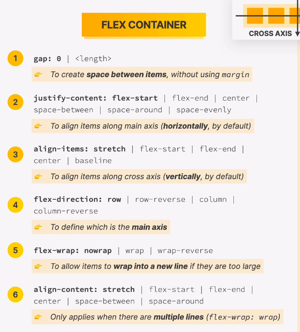
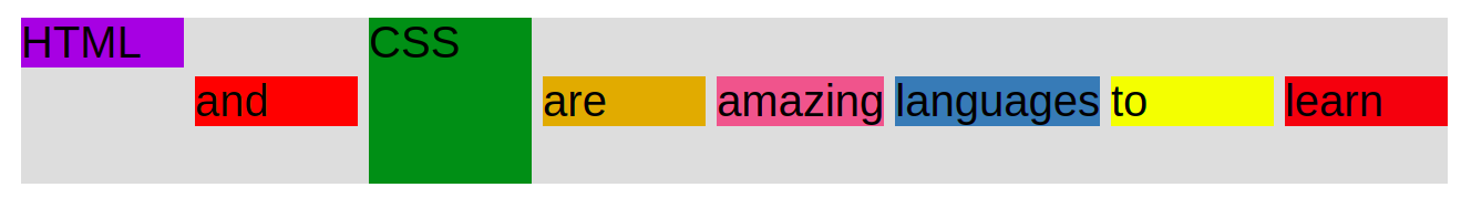
flexbox
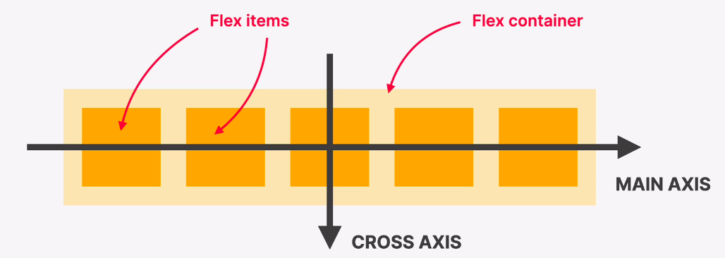 )
perfect for one-dimensional layouts. perfect for simple layouts. enables dividing space of a container between its children.
)
perfect for one-dimensional layouts. perfect for simple layouts. enables dividing space of a container between its children.
to use flexbox:
use display:flex. as prop in a container element.
.container {
      /* FLEXBOX */
      display: flex;
    }
and the container and its children:
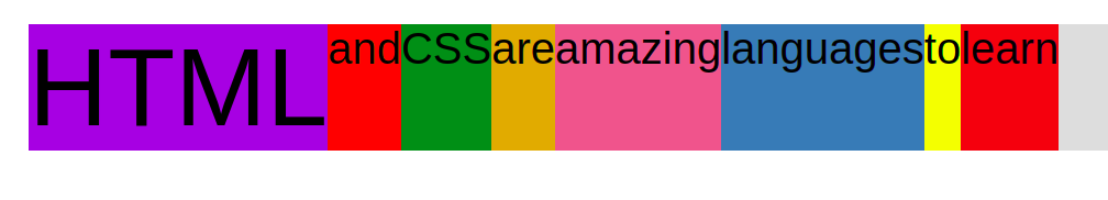
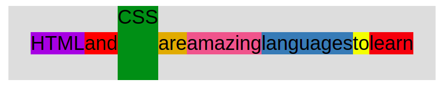
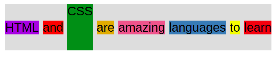
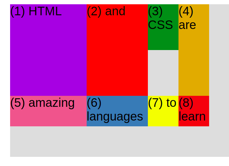
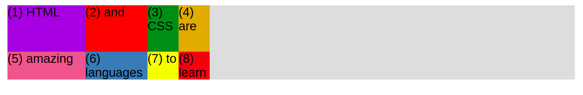
<div class="container">
    <div class="el el--1">HTML</div>
    <div class="el el--2">and</div>
    <div class="el el--3">CSS</div>
    <div class="el el--4">are</div>
    <div class="el el--5">amazing</div>
    <div class="el el--6">languages</div>
    <div class="el el--7">to</div>
    <div class="el el--8">learn</div>
 </div>
each flex element will take only the size it needs horizontally, but vertically they will all take the size of the largest element.
 )
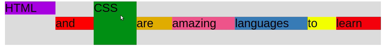
to center items vertically →align-items: center;
)
to center items vertically →align-items: center;
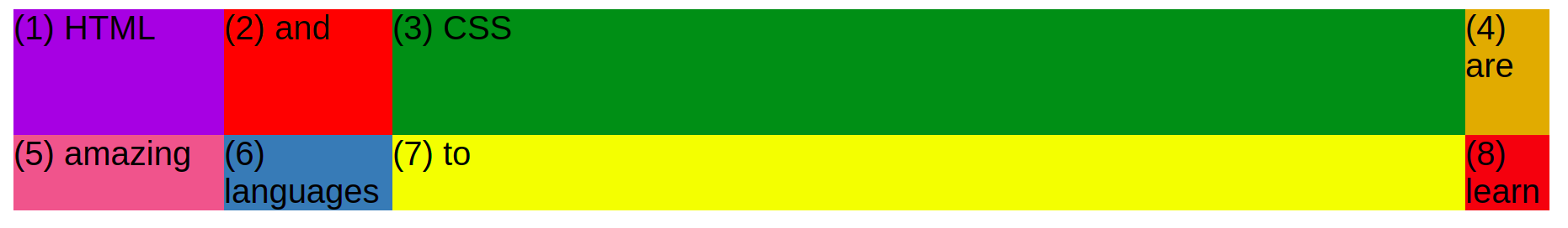
to center items horizontally → justify-content: center;
 )
to leave space between items use: justify-content: space-between;
)
to leave space between items use: justify-content: space-between;
 )
cheat sheets
)
cheat sheets
 )
)
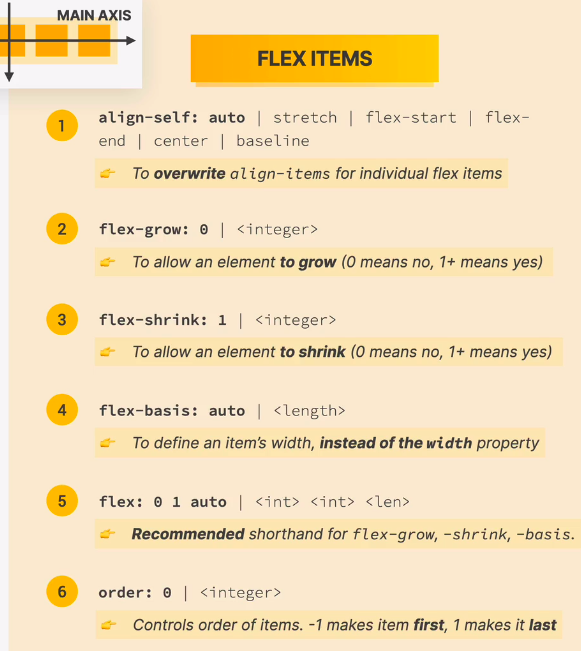 )
align-self is used to move flex element vertically.
)
align-self is used to move flex element vertically.
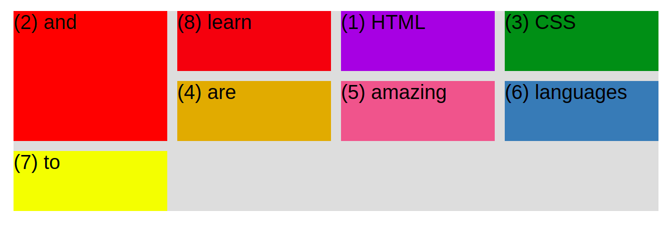
order: change the order of flex elements, the default value is zero, to move an element to begining use a number smaller than that.
the flex prop
- flex-basis: used to set the width of element. if element content is bigger than designated width it will outgrow the width to fit content. default is auto. this prop is merely a recommendation to the browser, the browser will override it and shrink elements so they fit in container.
- flex-shrink: default value is 1. setting it to 0 will apply flex-basis size regardless of container fit.
- flex-grow: opposite of flex-shrink. default is 0, setting it to 1 will make each flex element grow so that combined, they take all the space in container
 )
flex-basis set to 200px but the browser shrinks elements so they fit container
)
flex-basis set to 200px but the browser shrinks elements so they fit container
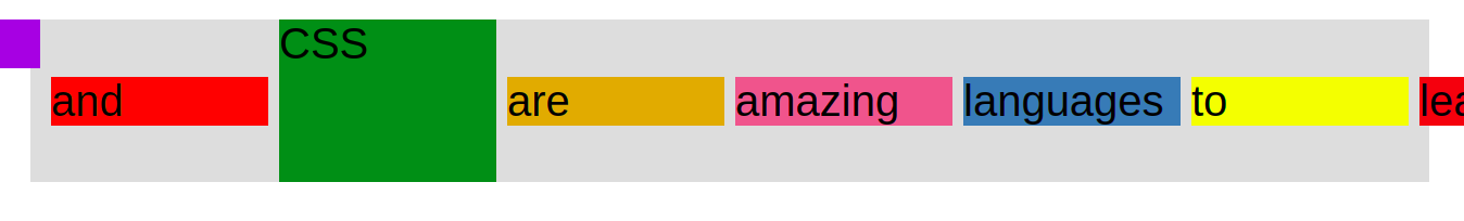 )
flex-shrink is set to 0 so flex-basis is applied, some elements are too big to fit.
)
flex-shrink is set to 0 so flex-basis is applied, some elements are too big to fit.
 )
flex-grow set to 1 and then 0.
)
flex-grow set to 1 and then 0.
you can apply flex grow using → flex: 1
you can also give each element a different relative size by giving it a larger flex-grow.
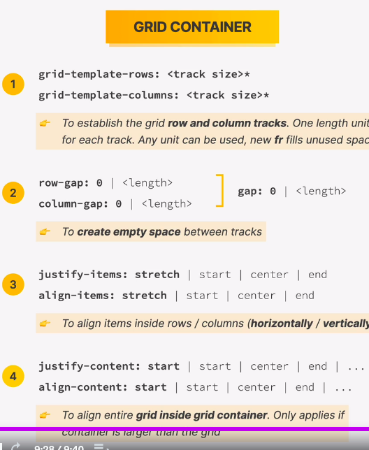
css grid
the most modern and complete way for building layouts.
2-dimensional layouts for big pages.
how it works:
- create a grid container
- specify the number and dimensions of columns
columns will be created and extra rows may be made to accommodate all elements.
.container{
display: grid;
grid-template-columns: 250px 200px 100px 100px;
}

/* to create equal size columns without repetition */
grid-template-columns: repeat(4, 250px);
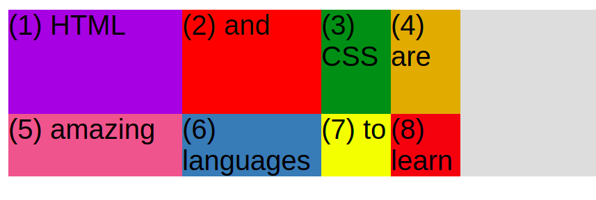 )
we created 4 columns, the rows were automatically created.
)
we created 4 columns, the rows were automatically created.
notice that the top row has more height since it takes the height of the largest element.
you can also define the height and number of columns.
grid-template-rows: 300px 100px 100px;
 )
now we have 3 rows as we defined
)
now we have 3 rows as we defined
we can also define column-gap and row-gap.
css grid overview
the idea is to divide a container into rows and columns that we can fill with child elements.
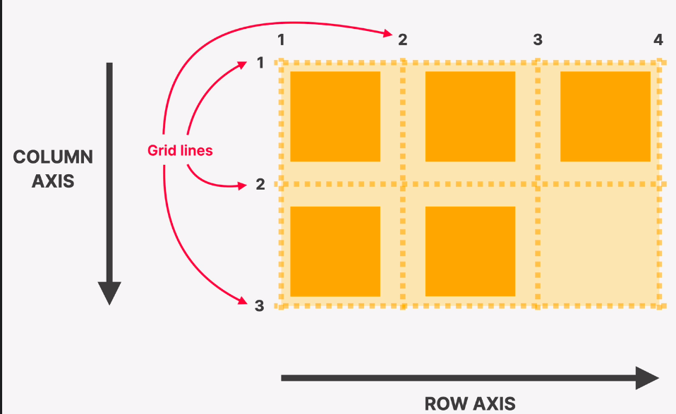 )
grid lines can be used to place an item where we want.
)
grid lines can be used to place an item where we want.
cheat sheets
 )
)
 )
)
creating flexible layout using fr (fraction) and auto
fr size is defined by the available space in container. containers either have explicit size or they simply imply size from their content
if you specify column size in fr instead of pixel then it will always expand to fill the available container space:
 )
before using fr
)
before using fr
 )
after using f1
)
after using f1
grid-template-columns: 250px 200px **1fr** 100px;
if you want a cell to only occupy a space equal to size of content then use “auto”.
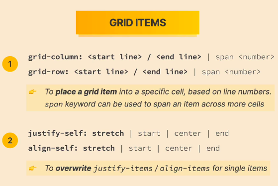
moving grid elements
using grid lines, we can specify the starting and ending place of each element
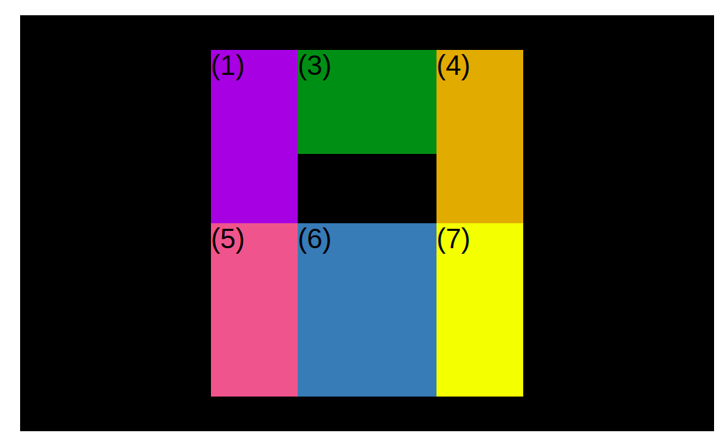
.el--8 {
      grid-column: 2/3;
      grid-row: 1/2;
    }
we can also use “span
.el--2 {
      grid-column: 1;
      grid-row: 1/span 3;
/* equivalent to: grid-row: 1/4;*/
    }
 )
we can also specify that the end grid line is the end line by using “-1”:
)
we can also specify that the end grid line is the end line by using “-1”:
.el--2 {
      grid-column: 1/-1;
      grid-row: 2;
    }
aligning grid inside container
this only works if container is bigger than grid.
/* aligning tracks inside container distrubute empty space */
      justify-content: center;
      align-content: center; /* vertical */
 )
)
aligning items inside cells
/* aligning items inside cells */
      align-items: center; /*vertical*/
			justify-items: center;
 )
)
design
typography
when linking google-font, do it in the header before our own css file:
<link rel="preconnect"
          href="https://fonts.googleapis.com">
    <link rel="preconnect"
          href="https://fonts.gstatic.com"
          crossorigin>
    <link href="https://fonts.googleapis.com/css2?family=Inter:wght@400;500;700&display=swap"
          rel="stylesheet">
    <link href="style.css"
          rel="stylesheet">
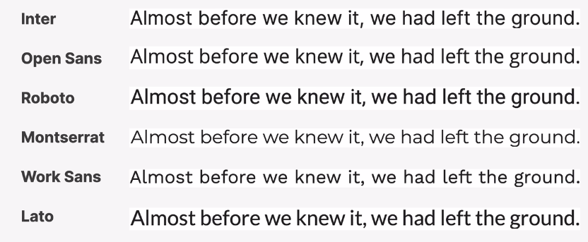
the instructor likes these sans-serif fonts of google fonts:
font size
limit your choices! use a ‘type scale’ tool or pre-defined range. (https://type-scale.com/)
16px - 32px for normal text.
20px use 20px or bigger.
reading experience
for readable paragraph keep the lines between 65-72 ch each.
use line height bw 1.5 and 2 for normal text. use smaller line height for larger text.
the smaller or longer the text the larger the line height.
use all caps and bold for short titles.
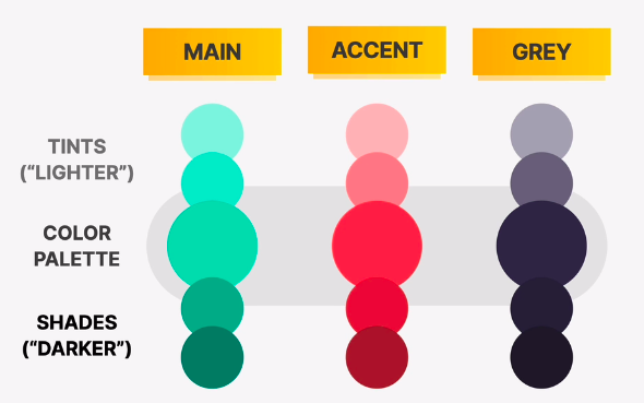
colorfonts
https://yeun.github.io/open-color/gray-color.htmlhttps://paletton.com/#uid=31l0u0kllllaFw0g0qFqFg0w0aF
we need at least two colors, a main and a grey color. we can also have an accent color. and for each of the colors we pick we want to have lighter and darker tones:
 )
)
images
use unsplash and uifaces.co
icons
ionicons
border radius
to make circle use border-radius: 50%, but the element must be square! is it is not then use a very large value.
find inspiration
land-book.com
patterns to design components and layouts
design process: create elements such as buttons and paragraphs → group them into components → use patterns to lay the components together → build the page using layouts.
 )
)
transfor prop
you can do many things with transform, we scaled an image so it overflows outside of its parent:
transform: scale(1.5);
 )
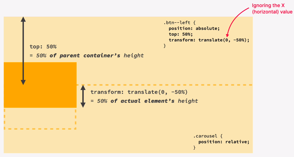
transform is also used with relative positioning to solve the problem of the fact that relative position moves the element from its starting point, so moving an element to 50% of height will place the start of element at that point, to solve that we transform and translate the element to move it up so its center is at the 50%
)
transform is also used with relative positioning to solve the problem of the fact that relative position moves the element from its starting point, so moving an element to 50% of height will place the start of element at that point, to solve that we transform and translate the element to move it up so its center is at the 50%
 )
)
notes
when applying padding on element make sure it is not just inline but inline-block.
to set the height of element to equal entire viewport we use the “vh” unit:
height: 100vh;
to set a background image:
background-image: url(./hero.jpg);
            background-size: cover;
to dim the background image we apply a rgba gradient and we set the opacity of colors to something low:
background-image: linear-gradient(rgba(0, 0, 0, 0.158), rgba(0, 0, 0, 0.582)), url(./hero.jpg);
            background-size: cover;
we were able to move the last element of a flex group all the way to the right by setting its left margin to auto which takes all available space:
margin-left: auto;
 )
)
the omnifood project
7 steps to build sites
define
who is the site for?
what is the site for?
define target audience.
plan
gather content (text, images …etc).
plan the sitemap, what pages you need and how they relate to each other.
plan the sections of each page.
always let the content guide the design.
pick a site personality.
sketch
think about what components you will use.
sketch using any tool.
this is an iterative process, experiment!.
design and build
design in the browser.
test and optimize
make sure it works on all popular browsers.
test on mobile devices.
optimize images: right dimensions and file size.
run lighthouse performance test.
think about seo.
launch
maintain
install analytics
tips and tricks from the project
the call-to-action section usually comes just before the footer.
the featured-in section comes after the hero.
the pricing section also comes at the end just before the call-to-action.
we like to select element using classes and not id or element selectors.
use buttons for actions only.
use anchor for linking to other pages or parts of same page.
use rem and max-width instead of px and width.
when adding a border on hover, the border prop adds it outside which moves other elements, fix this by using box-shadow: inset 0 0 0 3px #fff;
we can add a transition on hover by going to the original state (button:link) and adding: transition: background-color 500ms;
we use helper classes to add props to elements and reuse those classes everywhere, ex:
.margin-right-small {
  margin-right: 1.6rem !important;
}
we use the <main> tag with the site main content (all content that is not header or footer or is not repeated).
it is easier to set the height of images (you can see it better than width).
the links of the navigation should be part of <ul> to improve semantic meaning.
we create a reusable css grid class and a separate class for the grid size to increase reusability.
we cannot use pseudo classes (::after) with images.
we can create a square element using ::after like this:
width: 100%;
  /* height: auto; */
/* 60% of parent width */
  padding-bottom: 60%;
to send an element behind another use z-index with negative value on it.
the currentColor keyword applies the color prop of the element on any other prop.
transparent keyword is used to remove color.
use
use <aside> for additional info that is not important.
use the inherit on any prop that you want the element to inherit from parent.
you can select an element by one of its attributes like this:
ion-icon[name="close-outline"]
/** selects <ion-icon name="close-outline"></ion-icon> **/
display:none allows no animation or transition. an alternative is:
/* 1. hide it visually */
    opacity: 0;

    /* hide it from mouse and keyboard */
    pointer-events: none;

    /* hide it from screen readers */
    visibility: hidden;
position: fixed. will fix the element on the viewport and it wont move as we scroll.
metadata is data that describes data.
each image should have dimensions twice it largest display size.
use webp instead of png (available in gimp too).
test performance with Lighthouse
the tool is available at the inspect menu of chrome.
design scheme
/*
---- 01 TYPOGRAPHY SYSTEM

FONT SIZE SYSTEM (px)
10 / 12 / 14 / 16 / 18 / 20 / 24 / 30 / 36 / 44 / 52 / 62 / 74 / 86 / 98

Font weight:
default: 400

Line height:
default: 1

----02 colors:
    primary: #e67e22
    tints:
    shades:
    accents:
    greys: #555

----- 03 shadows

----- 04 border-radius

-----05 whitespace
 SPACING SYSTEM (px)
2 / 4 / 8 / 12 / 16 / 24 / 32 / 48 / 64 / 80 / 96 / 128

*/
responsive design
a method of letting web pages adjust its layout to any possible screen size.
the 4 big ingredients to responsive design:
- fluid layouts:
- allow the page to adjust to the viewport size.
- use % or vh/vw instead of px.
- use max-width instead of width.
- responsive units:
- use rem instead of px for most lengths.
- simplifies scaling the entire layout up or down automatically.
- trick: setting 1 rem to 10px for easy calculations.
- flexible images:
- images dont scale by default when we change the viewport, to enable scaling we set there dimensions using % and we use max-width.
- media queries:
- changes the CSS at certain viewport widths (breakpoints).
## rem and max-width
### max-width
only adapt the size of the element when it crosses the point of max-width. the element never becomes larger than max-width but it will get smaller as it adapts to a smaller viewport.
## rem
root-element-font-size. the root element is <html> and its default font-size is 16px.
one trick is to set the font-size in the <html> element to 10px to simplify the calculations. this trick comes with the problem that the resulting page font-size will not respect the user’s browser font-size. to fix that we set the html font size to 62.5% (10px/16px=0.625) so now the default font-size is 10px but if the user changes the font it will change too.
## media queries
enables overriding certain parts on our css at certain viewport width.
do not use pixel with queires.
 @media (max-width: 120em) {
   .section-hero {
     background-color: orangered;
   }
 }
for media queries to work, the html must inlcude this tag:
 <meta name="viewport"
           content="width=device-width, initial-scale=1.0">
if you create seperate file for queries, you must link it AFTER the original css.
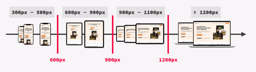
### breakpoints
viewport width at which we want the design to change.
try not to add too many queries, instead each query should work over a range of 300-400 pixels.
there are two methods of picking breakpoints
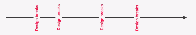
- we pick breakpoint ranges based on device groups.
- based on places where design breaks.
 )
)
 )
)
the power of rem
because we used rem in design, we can now make everything smaller at a breakpoint by simply changing the root-element-font-size.
 )
before and after changing the size of html font from 62% to 50%
)
before and after changing the size of html font from 62% to 50%